
Charts & Statistics Reference (2026)
Source
Original TradesViz blog post: https://www.tradesviz.com/blog/charts-statistics-reference/
Guide
With hundreds of charts and 600+ statistics, it can be hard for new users to know exactly where a chart lives in TradesViz. This guide is the complete, categorized map of every chart family and where to find it. Press CTRL-F to search this page, then follow the "Where to find" column to locate it in your dashboard.
This is Part 1 of our reference series. Part 2, the general statistics reference, covers every single-number stat and trades-table column.
What's new since 2021
The original version of this guide listed a couple of dozen chart types. The 2026 dashboard is a very different platform. Major additions since 2021 include drag-and-drop custom dashboards, an entire AI suite (Q&A, trade chat, coach, daily insights), full options analytics, MFE/MAE and multi-timeframe exit analysis, continuous/cumulative per-day metrics, distribution curves, drawdown charts, seasonality, pivot-grid charting, prop-firm compliance, and a redesigned, searchable Overall Statistics tab.
Catch up on what changed in each release: 2023 revamp, Nov 2024, Dec 2025, Feb 2026 UI refinements, Apr 2026, and Apr-May 2026 QoL updates.
Throughout 2026 you can also build any of these charts as movable widgets on a custom dashboard, including AI-generated widgets.
June 2026 update: unified Symbols / Sectors / Industries, and a new Activity tab
In June 2026 we rebuilt two of the most-used analysis areas to match the depth of Tags Analysis v2. Both follow the same idea: instead of a wall of repetitive bar charts, each tab opens with a switchable header and a small set of charts where every chart answers a specific, actionable question and supports one-click drill-to-trades.
Symbols, Sectors & Industries (one tab, switchable)
What changed: the previously separate Symbols and Sectors chart tabs are now a single Symbols / Sectors / Industries tab with a toggle at the top. Industry was added as a first-class classification alongside Sector, everywhere a sector breakdown existed. Pick the classification once and every chart on the tab re-renders for it.
What you get per classification: summary cards (count meeting your minimum-trades filter, best/worst PnL, best win rate, most traded), a ranking chart with a metric dropdown (Total PnL, Avg PnL/trade, Win rate, Trade count, Volume, Duration) and a minimum-trades input, a single win/loss mix chart, a participation row (Volume, Trade count and Duration shown together), an edge-vs-participation scatter, and a sortable leaderboard. Click any bar, cell or point to jump straight to the trades behind it.
Activity: Trade Count, Volume & Time-in-Market in one place
What changed: the previously separate Trade Count and Volume chart tabs are replaced by a single Activity tab with a three-way switch — Trade Count, Volume and Duration (time in market, a brand-new view). The guiding idea: your activity is the cost (trades taken, size deployed, time held); PnL is the reward. Every chart is built to answer one question: is my effort, capital and time going where the edge actually is?
The charts (each re-renders for the active metric):
- Activity vs PnL by dimension — bars show where your trades / volume / time go, with a Net PnL line overlaid, grouped by Time of Day, Day of Week, Month, Price/Volume/Duration range, Side, Asset, Symbol or Tag. The misallocation detector.
- Win rate by activity-intensity bucket — buckets trades by the metric itself: by position size (are my biggest trades my worst?), by hold time (do my longest holds lose?), or by trades-per-day (do my busiest days tank my win rate? — the overtrading detector).
- Activity over time — by weekday, month or year, with a Net PnL line, to spot over-trading streaks, size creep and lengthening holds.
- When You Trade — a weekday x time-of-day heatmap of your activity. Click any cell to drill into that weekday + time window.
- Consistency / distribution — how spread out your position sizes, hold times, or daily trade counts are.
Five summary cards across the top show the total, the per-group average, your busiest group, your most-active losing group, and the share of activity sitting in losing groups.

As with every chart in TradesViz, all of these are fully interactive — expand them, explore a data point straight into its trades, and right-click to filter the whole dashboard.
Working with charts
Every chart in TradesViz shares the same set of interactions, so once you learn them on one chart they work everywhere. Here is a short video showing the 4 actions possible with all charts.
- Expand any chart: click a chart (or its expand icon) to open it full-screen for a closer look.
- Explore a data point: click any bar, point or slice to open the chart view for the exact trades behind that value. This lets you go from a summary straight into the underlying trades.
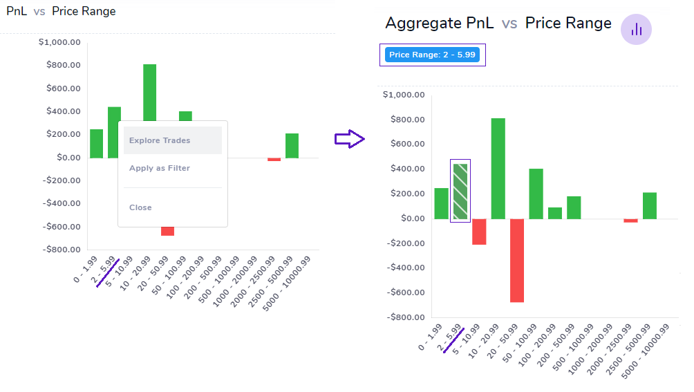
- Filter any data point: right-click on any bar/data point to apply that data point's x-axis label as the global filter.
- Drill down (right-click): right-click a data point to see what made it up, and apply that bucket as a global x-axis filter across the whole dashboard. For example, right-click the "Monday" bar to filter every chart and table down to your Monday trades.
- Explain with AI (new): ask the AI chat to explain any chart in plain English. It reads the chart's data and tells you what stands out, what it means, and where to look next. See AI trade chat.
Overview, equity & date charts
Chart | Where to find | Notes |
|---|---|---|
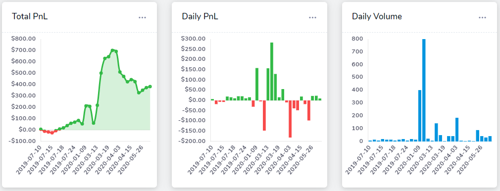
Total PnL / Volume / Win-rate vs Date (recent) | Overview > Daily Statistics | Pick the window via the Trading History dropdown |
Daily PnL (bar) and Daily Wins/Losses | Overview > Daily Statistics | |
Full equity curve (deposits only / deposits & withdrawals / + dividends) | Overview > Equity Curve | The only charts that include cash movements. See deposits & withdrawals and dividend tracking |
Equity curve compared by symbol | Date Charts | |
PnL / Volume / No. of trades vs Year / Month / Day | Date Charts > Calendar-grouped | Use the 3-dot menu to pick year/month |
Aggregate PnL / Volume / Trades / Position vs Grouped Timeframe | Date Charts > Day-grouped | Use a larger timeframe to view all data |
Continuous / unrealized running PnL | Date Charts |
Profit & Loss / Win-rate / Hit-ratio analysis
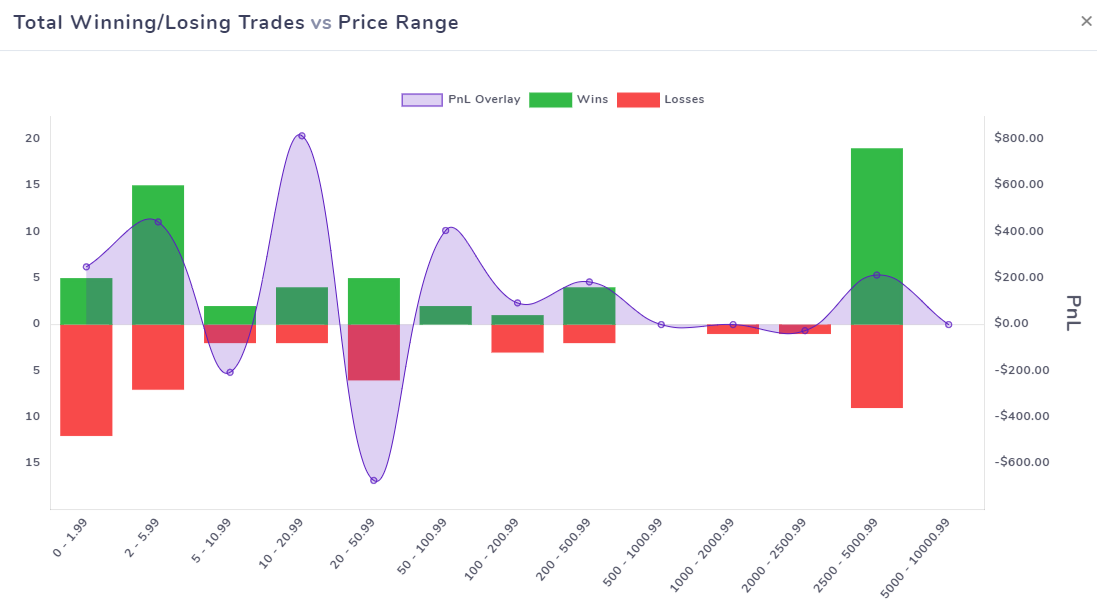
Both PnL and Win-rate (and Hit-ratio) chart families share the same set of grouping dimensions, so you can analyze performance from every angle. Found under Trades Analysis Charts.
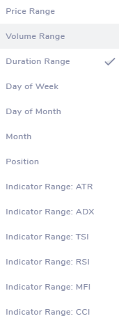
A dimension is the category on the x-axis that trades are grouped into. It can be price range, volume range, time of day, day of week, month, year, trade duration, position, symbol, and so on. The chart then plots a metric (PnL, win-rate, volume, and so on) on the y-axis for each of those groups.
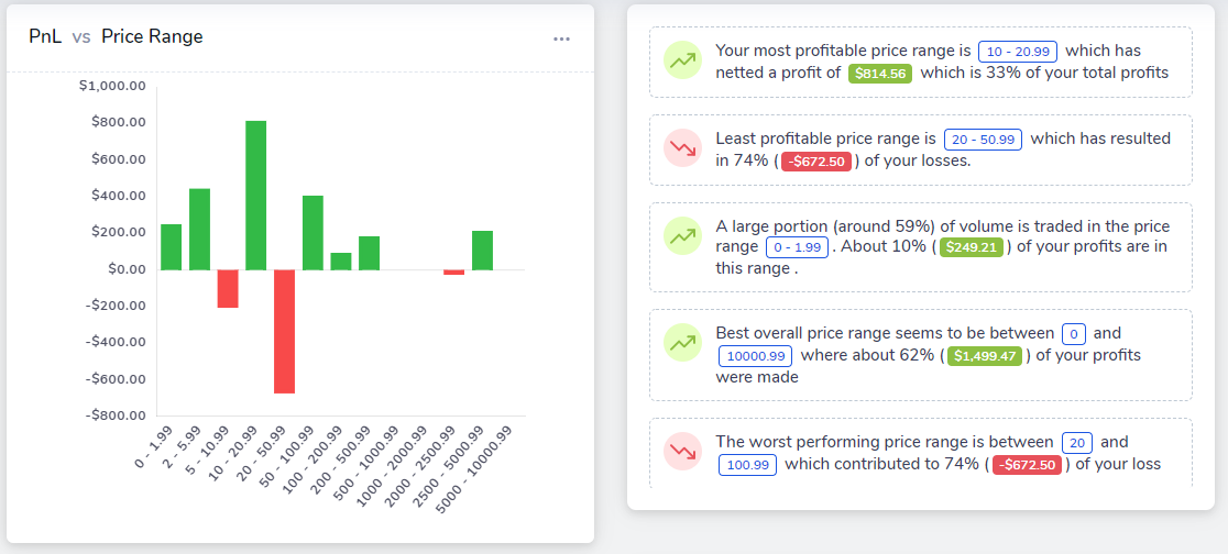
You will notice that the pnl and win-rate charts have auto-generated insights next to them. You can click on "more details" to get an expanded view of those insights. The above chart example shows an example of both the expanded view and the summary view. These are 100% deterministic insights that are unique to the TradesViz charts. They use all the data points of the chart (pnl, volume, trade count and the relevant x-axis label) to derive useful insights and patterns.
Dimension: the category on the x-axis that trades are grouped into. It can be price range, volume range, time of day, day of week, month, year, trade duration, position, symbol, and so on. The chart then plots a metric (PnL, win-rate, volume, and so on) on the y-axis for each of those groups.
Chart family | Where to find | Grouping dimensions |
|---|---|---|
PnL vs [dimension] | Trades Analysis Charts > Profit and Loss | Price range, Volume range, Time, Day of week, Month, Year, Trade duration, Position, Asset type, Grouped timeframe |
Win-rate vs [dimension] | Trades Analysis Charts > Win-Rate | |
Hit Ratio vs [dimension] (incl. Top/Bottom Symbols, Tags, Sectors) | Performance Metrics Charts | |
Averaged Win/Loss % vs Month | Trades Analysis Charts > Win-Rate |
Win-rate charts support a "Win-rate type" dropdown (count vs % of winning/losing trades) that applies to all win-rate charts.
Performance metrics (Reward/Risk, Expectancy, Profit Factor)
Found under Performance Metrics Charts. See the new performance metrics guide for a deeper walkthrough.
Chart family | Where to find | Notes |
|---|---|---|
Risk-reward (R:R) ratio vs Price range / Time / Duration / Day / Month / Year / Position | Performance Metrics Charts > General Metrics | |
Cumulative Profit Factor / Expectancy / Hit Ratio / R-value Ratio / Reward-Risk Ratio per day | Performance Metrics Charts | Running performance over time |
Cumulative average per-trade PnL / MFE / price MAE/MFE / return % / duration / executions / commission / fees / quantity per day | Performance Metrics Charts | |
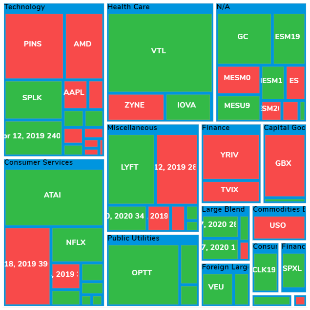
Treemaps: PnL / Volume / Trades / Duration vs Symbol / Tag / Sector | Performance Metrics Charts > Treemaps | Pick metric, count and sort order |
Trend Analysis: per-trade / per-execution metric trends with moving averages (PnL, R-value, win-rate, and more) | Trades Analysis Charts > Trend Analysis |
Trend Analysis chart: what it is and why to use it
What it is: you already use moving averages on price charts to see the trend of price over time. Trend Analysis applies the same idea to your trading performance. Instead of plotting against the date, it plots per trade (or per execution), so you can answer questions like "what is the trend of my R-value over the last 100 trades?"
Why use it: it shows whether a metric (PnL, R-value, win-rate, duration, and more) is improving, flattening or slipping as you take more trades, with a moving-average line that smooths out the noise. It is the fastest way to see if recent changes to your trading are actually working. Full guide →
Distribution & drawdown
**What it is:**A distribution chart buckets your trades and shows how many fall into each PnL, % return, or R-value range. In short, it shows the shape of your results.
Why use it: it tells you at a glance whether most of your trades are small and similar, or whether a handful of big winners (or losers) drive everything. A long tail on the loss side is a warning that one bad trade can undo many good ones. Use it to check consistency and to spot outliers.
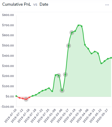
Chart | Where to find | Notes |
|---|---|---|
Distribution of Gains and Losses in PnL / % / R-value | Trades Analysis Charts > Distribution | |
Drawdown chart (EOD) and Drawdown chart (30 min) | Performance Metrics Charts > Drawdown |
Symbols, Sectors, Tags & Tag Groups
What it is: charts that break your PnL, win-rate, volume and duration down by the tags you attach to trades. Tags can be anything you track: setups, mistakes, emotions, sessions, news, and so on. Tag groups roll related tags together.
Why use it: tags turn your written notes into numbers. Instead of guessing which setup works, the tag charts show you exactly which tags make money and which ones to cut.
How to use it: tag your trades (one by one, with import rules, or in bulk), group related tags into tag groups, then open the Tags Analysis charts to compare them by best/worst PnL, win-rate, most/least traded and longest/shortest duration. See Tags Analysis v2, the tags guide and bulk tagging.
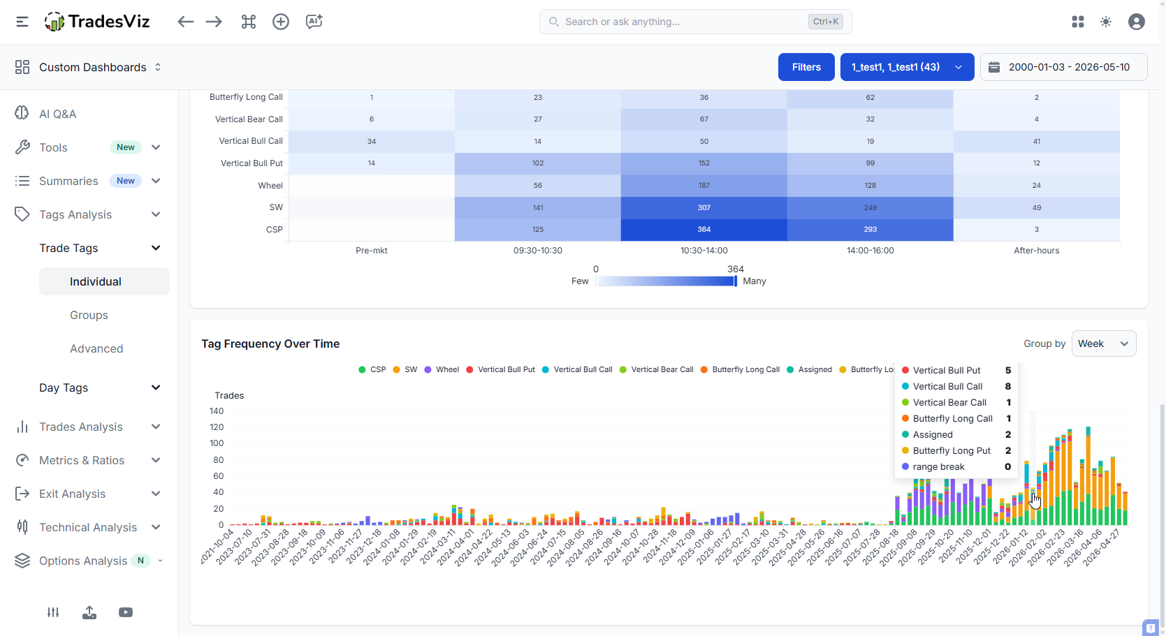
Chart family | Where to find | Notes |
|---|---|---|
Best / worst Symbols, Sectors & Industries by PnL; most / least traded by Volume / Trades; win rate, duration and edge-vs-participation | Trades Analysis Charts > Symbols / Sectors / Industries | One tab; toggle Symbol / Sector / Industry. Pick the metric and a Min trades filter. See the June 2026 update above. |
Best / Least performing Tags & Tag Groups by PnL; win-rates (%/No./PnL); longest/shortest duration; most/least traded | Tags Analysis | |
Day Tags & Day Tag Groups (same families, applied to per-day tags) | Tags Analysis |
MFE / MAE & exit analysis
A scatter chart looks like a cloud of dots, but it is simple: each dot is one trade. Green dots are wins, red dots are losses.
One axis is the MFE or MAE value, the other is PnL, volume or time. You read it by looking at where the dots sit.
How to use it, with an example: if a lot of your winners have a high MFE but their PnL is near zero, you let winners come back to breakeven, so you are leaving money on the table. If your losers show a large MAE, they went deep against you before you got out, so your stops may be too loose. Clean entries show wins with low MAE. MFE/MAE charts, MFE/MAE duration →
What it is: Best Exit shows the best PnL you could have captured if you had exited at the ideal time after your last execution, next to what you actually made. Exit Efficiency is the percentage of that best exit you captured. These are plotted against time of day, duration, day, month and more.
How to read it: when the Best Exit PnL bar is tall but your actual PnL was much smaller, you exited too early or too late for that bucket.
Example: if Best Exit PnL peaks in the 1-day to 2-day holding range but most of your trades are much shorter, holding a little longer may help. An Exit Efficiency near 100% means your timing is already good. Exit analysis, EOD exit, multi-timeframe exit →
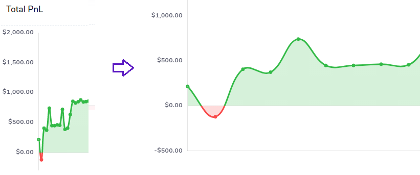
Chart family | Where to find | Notes |
|---|---|---|
MFE / MAE (Price, Price %, Tick, Trade) vs Open time / Close time / PnL / Volume | Performance Metrics Charts > MFE/MAE Metrics | |
Best Exit PnL / Best Efficiency vs [dimension]; Efficiency vs Close/Best-Exit time | Performance Metrics Charts > Exit Analysis | |
EOD Exit PnL / EOD Efficiency vs [dimension] | Performance Metrics Charts > Exit Analysis | |
Multi-timeframe exit analysis & exit PnL | Performance Metrics Charts | |
High / Low of Running PnL Duration vs PnL | Performance Metrics Charts |
Commissions, R-value, points & ticks
Chart family | Where to find | Notes |
|---|---|---|
Commissions / Fees / Commissions + Fees vs Day / Month / Year / Time / Asset type | Trades Analysis Charts > Commissions | |
R-value distributions & statistics | Performance Metrics Charts | |
Points & ticks PnL statistics (futures) | Trades Analysis Charts | |
Relative volume analysis | Trades Analysis Charts |
Options analytics
A full options suite was added across 2024 to 2026. Charts live under Options Trades Analysis Charts and the dedicated options tools.
The new Options command center, launched late 2025 and upgraded throughout 2026, has been the center of attention of all option traders as strategies such as wheeling/CSPs have increased, and there does not exist any online tool that can reliably track and provide useful summaries and metrics for them. That's why we took this problem and created the most comprehensive options trading dashboard ever. You can view greeks summary, portfolio risk metrics, premium gained/realized, strategy view, and more - all in a single tab.
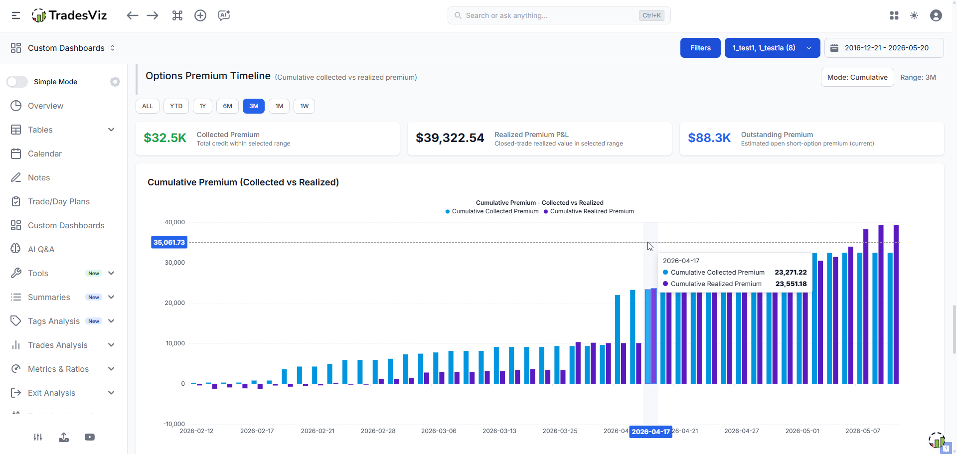
Chart / tool | Where to find | Notes |
|---|---|---|
PnL / Win-rate / R:R vs Delta / Abs Delta / Theta / Gamma / Rho / Vega / IV | Options Trades Analysis Charts | |
Options dashboard & command center | Tools > Options | |
Options flow dashboard & scan | Tools > Options Flow | |
Payoff / intraday charts; spread input; execution simulation | Tools > Options | |
NSE options charts (India) | Tools > Options |
Technical analysis, seasonality & market data
Chart family | Where to find | Notes |
|---|---|---|
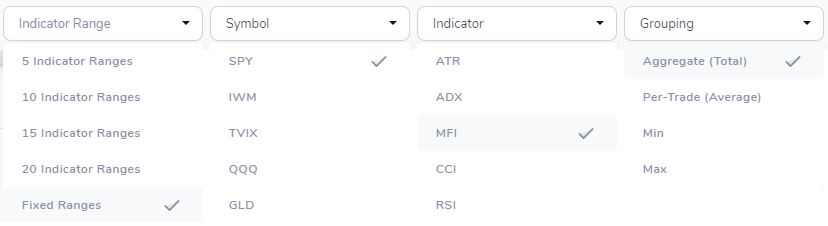
PnL vs [Indicator] of [Symbol] / of all traded symbols (ATR, ADX, MFI, CCI, RSI, TSI, % price/vol gap, 14-day % change) | Technical Analysis Charts | |
Seasonality charts, portfolios & screener | Tools > Seasonality | |
Fundamental data & AI fundamentals Q&A | Symbol tools | |
Real-time & daily stock screener | Tools > Screener |
Compare, pivot & account-level analysis
The pivot grid dashboard is the most advanced online charting system available to traders. Within the TradesViz system, you can create custom columns, analyze and slice across 100s of stats for tens of thousands of trades in mere seconds. No other platform comes close to this - which is why, since the introduction of advanced grids in TradesViz v2.0, there has been a lot of interest and usage of TradesViz by professionals. While you may not need this if you are just getting started, ignoring this in pursuit of "simplicity" and "easy charts" is akin to ruining what little chance you have as a retail trader to make it in this incredibly difficult, odds-stacked-against-you field. Learn, explore, think deeply. Don't outsource this to an AI
Tool | Where to find | Notes |
|---|---|---|
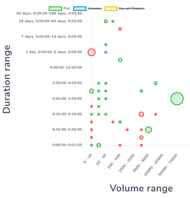
[Any stat] vs [Any stat] compare (bubble chart) | Grouped Compare > Compare Ranges/Classes | Price/volume/duration range, day, month, position, ATR, ADX, TSI, RSI, MFI, CCI, gaps, 14-day % changes |
Compare specific trades side-by-side | Trades Analysis | |
Pivot-grid charting & custom stats | Tables > Pivot Grid | |
Accounts statistics comparison | Overview > Accounts Statistics | |
Prop-firm compliance tracking | Overview > Prop Firm Compliance |
Custom dashboards, AI & simulators
Don't like or prefer any of the above charts? Not a problem. Use AI, your creativity, knowledge, and create your own using AI widgets. Read more here. This is the next generation of trade journaling dashboards. Some traders choose Excel because of it's flexibltiy, and some choose simple online journals for ease of use. Now some traders primarily use AI because of its ease of use + feedback (while sacrificing precision). What if we can combine the best of all of those? That's AI widgets on TradesViz. Use AI queries to create 100% custom charts using the trading data that TradesViz has generated for you and add these as charts on your custom dashboards. Advanced traders have multiple dashboards with dozens of these widgets.
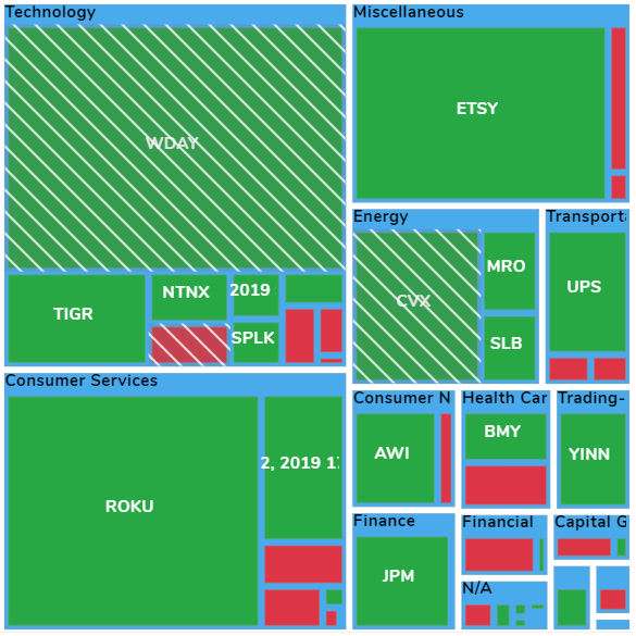
The possibilities are endless. It's not AI hallucinations. It's not random LLM slop. It's your trading data visualized in the way you want where the process is powered by AI.

- Custom dashboards: drag any chart/stat into a personal layout. Guides: custom dashboard, sidebar, new widgets 1, new widgets 2, auto-generated charts, new chart types.
- AI suite: AI Q&A (examples), trade chat, AI coach, daily insights, AI notes, AI widget marketplace, advanced AI journaling.
- Simulators & backtester: all simulators, backtester, replay simulator, multi-chart simulator, universal simulator, pattern backtesting.
- TradingView charts: TV chart view, custom indicators, global templates, interactive charts.
Statistics (single numbers)
All single-number summaries live under Overview > Overall Statistics, redesigned in 2026 into a single searchable, collapsible page with 150+ metrics (PnL, gross/net, account value, performance ratios, trades, volume, symbol, duration, commissions). For the full definition of every stat and table column, see the general statistics reference.
If you have a question about a feature, it is likely already answered in our product usage FAQ: tradesviz.com/product-faq.
For feature requests or help using any feature, contact us at support@tradesviz.com or via our contact form.
Updated on: 17/07/2026
Thank you!