
Options Command Center: Portfolio, Greeks, Exposure and Risk Tracking
Source
Original TradesViz blog post: https://www.tradesviz.com/blog/options-command-center/
Guide
The Options Command Center: Your Complete Guide to the Options Portfolio Dashboard
Options traders, this one's for you. Whether you're running the wheel strategy, selling covered calls, managing iron condors, or trading complex multi-leg spreads - tracking your options portfolio has always been a nightmare. You're juggling Greeks across positions, monitoring multiple expirations, and trying to understand your true risk exposure... usually across multiple spreadsheets that break the moment you add a new position.
Not anymore.
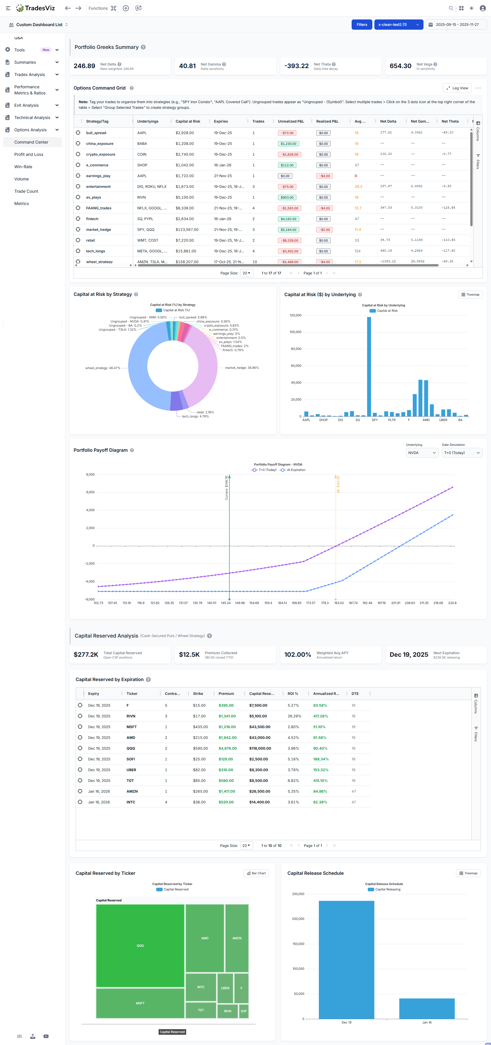
Today, we're introducing the **Options Command Center.**The most comprehensive options portfolio dashboard available in any online trading journal. This isn't a basic P&L tracker with a few stats bolted on. This pulls in data from various parts of your account and from our data sources to provide you with a centralized view of your open options positions, and it's just the beginning.
We've built this from the ground up based on feedback from thousands of options traders on TradesViz. Every feature you're about to see exists because traders asked for it. Let's dive in.
What's in the Options Command Center?
Before we go deep into each feature, here's what you're getting:
- Net Greeks Summary Cards: Delta, Gamma, Theta, and Vega aggregated across your entire portfolio
- Options Command Grid: Strategy-level view with grouping, drill-down to individual legs, P&L color coding, and DTE warnings
- Capital at Risk Charts: Visual breakdown of your capital allocation by strategy and underlying
- Portfolio Payoff Diagram: Interactive T+0 and expiration payoff curves for any underlying
- Cash-Secured Put Analytics: Dedicated CSP analysis with ROI, APY calculations, and capital release scheduling
- Wheel Strategy Cost Basis: Premium-adjusted cost basis by underlying for wheel traders tracking CSPs, covered calls, assignments, and shares held
- Strategy Grouping: Seamless integration with TradesViz's existing tagging system
- Combined Monthly + Strategy Summary: Cashflow-style monthly rollup plus strategy snapshot in one section
- Options Premium Timeline: Range-based premium tracking with a Daily/Cumulative toggle for collected vs realized premium
Remember: All stats you see are ONLY based on open trades.
You can find the options dashboard under the Options analysis tab in your TradesViz dashboard.
Net Greeks Summary Cards: Know Your Portfolio-Level Risk Instantly
At the top of the dashboard, you'll find four cards showing your aggregate Greek exposure across all open options positions. This is portfolio-level risk management that most retail traders never get to see... or bother looking at... but it's essential to understand this. Read on.

Understanding the Greeks (Quick Refresher)
If you're already familiar with options Greeks, skip ahead. If not, here's what each one tells you:
Delta (Δ) measures directional exposure. A portfolio delta of +250 means your positions behave like owning 250 shares of the underlying. If the overall market rises $1, you gain approximately $250.
[Jan 2026 Update]
Beta-Weighted Delta takes this a step further. Raw delta is misleading when you have positions across different underlyings - a delta of +100 in AAPL is very different from +100 in TSLA because they move differently relative to the market. Beta-weighted delta normalizes all your positions to SPY-equivalent shares using the formula:
β-weighted Δ = Σ (Position Delta × Beta × Underlying Price / SPY Price)
This converts your entire portfolio into "how many shares of SPY is my portfolio equivalent to?" A beta-weighted delta of +200 means your portfolio behaves like owning 200 shares of SPY. This is the standard way institutional traders measure directional risk across diverse portfolios. Hover over the Net Delta card to see a breakdown by underlying showing each position's contribution.
Gamma (Γ) measures how fast your delta changes. High gamma means your directional exposure can shift rapidly as prices move. This is highest for at-the-money options near expiration.
Theta (Θ) is your daily time decay. Positive theta means you're collecting decay (you're net short options). Negative theta means you're paying it (you're net long options). A theta of -$400 means your portfolio loses roughly $400 per day just from the passage of time, all else equal.
Vega (ν) measures sensitivity to implied volatility. A vega of +650 means a 1% increase in IV across your positions adds ~$650 to your portfolio value.
Why Portfolio-Level Greeks Matter
Individual position Greeks tell you about one trade. Portfolio Greeks tell you about your actual risk. You might think you're "hedged" because you have some long calls and some short puts, but without aggregating the Greeks, you have no idea if those positions actually offset each other.
The Options Command Center does this automatically. Because all of what you see here is built on years of feature requests. TradesViz is still the only trading journal that has and generates Greeks for your executions. This was introduced in 2020 - back when showing pnl in a calendar was considered a "big deal" (at least for other journals.. and hey, it still is... .
For example, if your Net Delta shows +500 and your Net Theta shows -$200, you know immediately:
- You have significant bullish exposure (equivalent to 500 shares)
- Time decay is working against you ($200/day erosion)
- You need the underlying to rise to offset theta losses
This is the kind of visibility that transforms how you manage an options portfolio. Now, what journal(s) show you this? TradesViz and... wait.. that's it.
The Options Command Grid: Your Strategy-Level Control Panel
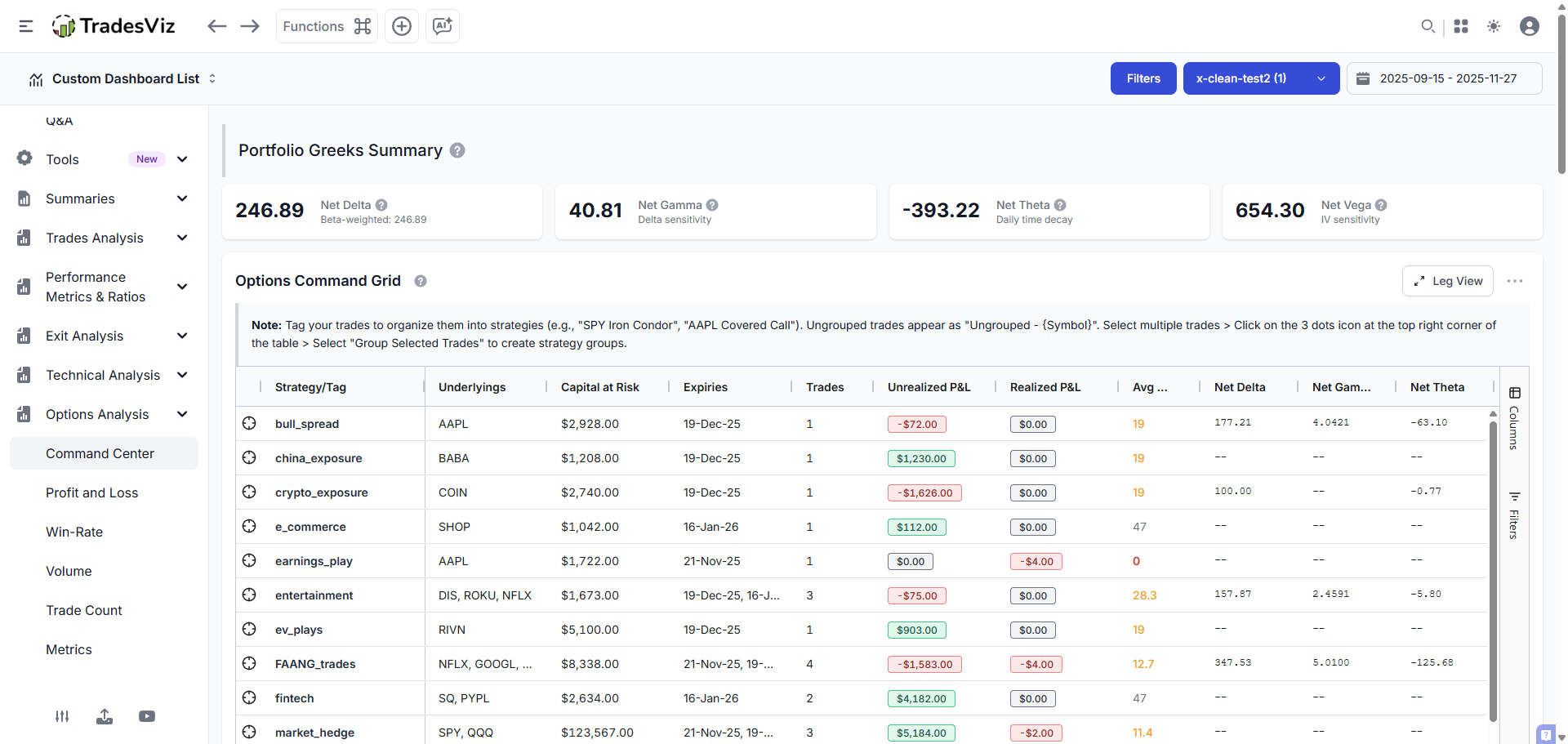
This is where things get powerful. The Command Grid displays all your options positions grouped by strategy, with full aggregation of Greeks, P&L, capital, and DTE at the strategy level.
Strategy View vs. Leg View
The grid operates in two modes:
Strategy View shows your positions grouped by their assigned tag (strategy name). Double-click on any row to expand and see the individual trades within that strategy. This is your high-level view. Haven't been using tags? Now is a good time.
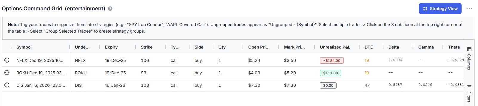
Leg View drills down to show individual option legs with full execution details, strike, expiry, side, quantity, entry price, current price, P&L, and leg-level Greeks. Double-click any strategy row to jump directly to its legs, and click on the "Strategy view" button when in leg view to switch back to Strategy view.
Grid Columns Explained
Column | What It Shows | Why It Matters |
|---|---|---|
Strategy/Tag | The tag name grouping these trades | Organize by strategy type (wheel, spreads, hedges, etc.) |
Underlyings | Stock/ETF symbols in this strategy | See concentration risk at a glance |
Capital at Risk | Total capital deployed or reserved | Know your actual dollar exposure |
Expiries | Expiration dates for positions | Manage upcoming expirations |
Trades | Number of individual positions | Strategy complexity indicator |
Unrealized P&L | Current profit/loss on open positions | What you'd gain/lose if closed now |
Realized P&L | Profit/loss from closed positions | Locked-in gains/losses for the strategy |
Avg DTE | Average days to expiration | Time remaining across positions |
Net Greeks | Aggregated Delta, Gamma, Theta, Vega | Strategy-level risk assessment |
DTE Color Coding
The Avg DTE column uses smart color coding to highlight expiration urgency:
- 🔴 Red (≤7 days): Critical! Position expires this week. Gamma risk is elevated.
- 🟡 Yellow (≤30 days): Warning. Theta decay is accelerating. Time to decide: roll, close, or hold.
- 🟢 Green (>30 days): Comfortable time buffer. Standard management applies.
This visual system means you'll never be caught off-guard by an expiring position. The grid literally tells you which strategies need attention right now.
P&L Color Coding
Unrealized and Realized P&L columns are color-coded too:
- Green = Profitable
- Red = Losing
Simple. Effective. You can scan 20 strategies in 5 seconds and know exactly where your winners and losers are.
Capital at Risk Analysis: Where Is Your Money Actually Deployed?
"Capital at Risk" answers the question every options trader should be asking: How much of my account is tied up in options positions right now?
This calculation differs based on position type:
For Long Options (Bought Calls/Puts)
Capital at Risk = Premium Paid × Contracts × 100
Example: You bought 2 AAPL Jan 2026 $200 Calls at $15.50.
Capital at Risk = $15.50 × 2 × 100 = $3,100
This is your maximum possible loss. If the options expire worthless, you lose $3,100.
For Short Options (Sold Calls/Puts)
Capital Reserved = Strike Price × Contracts × 100
Example: You sold 1 TSLA Dec 2025 $250 Put.
Capital Reserved = $250 × 1 × 100 = $25,000
This is how much cash you must have available if assigned (to buy 100 shares at $250).
Why Short Options Show Larger Capital Numbers
A $3 premium on a $200 put might seem like a small position. But if assigned, you're obligated to buy $20,000 worth of stock! This is why the dashboard shows Capital Reserved (strike-based) for short puts rather than just the premium received. This is your true capital commitment.
Capital at Risk Charts
Two charts visualize your capital distribution:
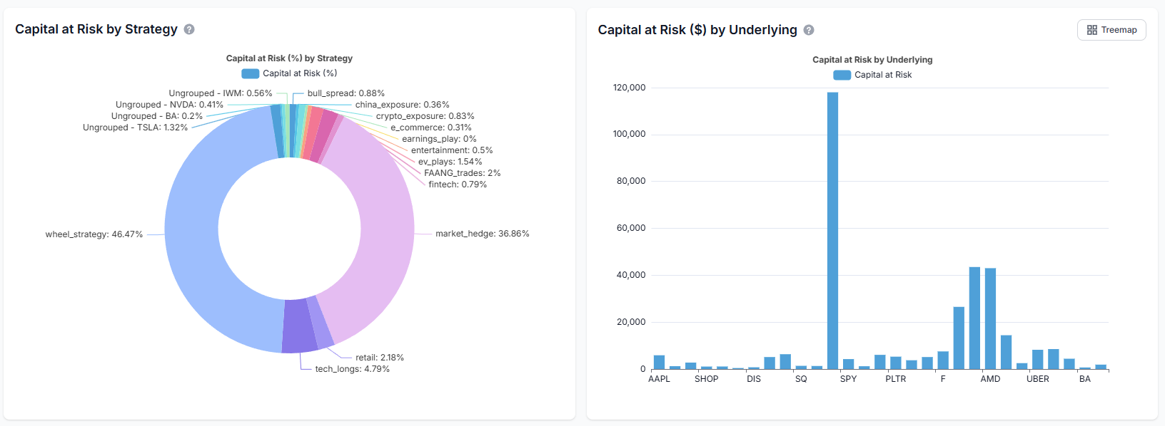
Capital by Strategy (Pie Chart) shows what percentage of your capital is allocated to each strategy type. If your wheel strategy is consuming 60% of your capital, you'll see it immediately.
Capital by Underlying (Treemap/Bar Chart) shows concentration risk by individual stock. Use the toggle button to switch between treemap (better for seeing relative sizes) and bar chart (better for precise comparisons).
The treemap view is particularly useful for identifying overconcentration. If TSLA is taking up half your visual space, you have half your capital at risk on one underlying. That might be intentional, or it might be a risk you didn't realize you were taking.
Portfolio Payoff Diagram: Visualize Your Risk/Reward Profile
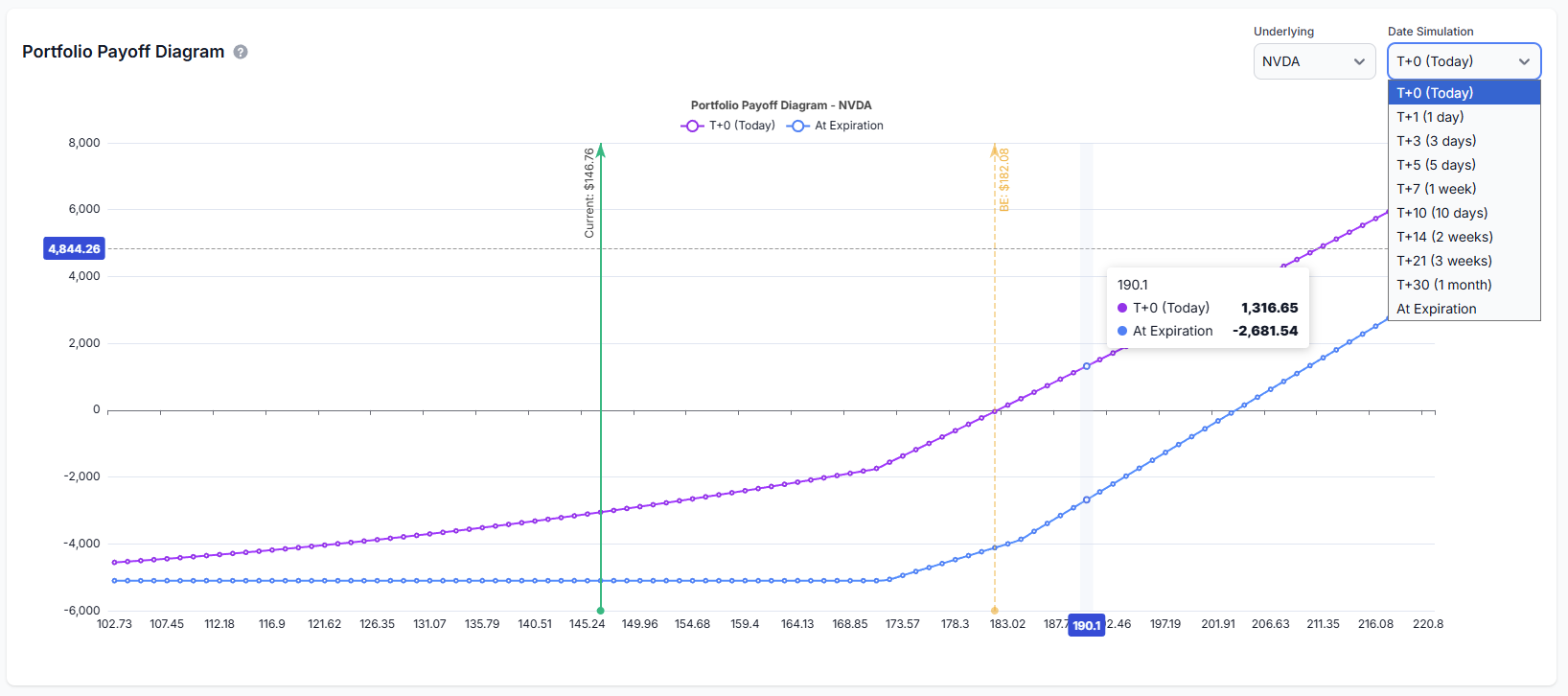
This is the feature experienced options traders have been asking for. The payoff diagram visualizes your portfolio's profit and loss across a range of underlying prices.
Reading the Payoff Diagram
The diagram displays two key lines for multiple date ranges - like T+3, T+17, T+15, etc.:
Line | What It Shows |
|---|---|
T+0 (Today) | Your theoretical P&L if you closed the position at various prices right now. Includes time value. |
At Expiration | Your P&L at expiration when options have no time value left. The classic "kinked" payoff profile. |
The gap between the two lines represents time value (extrinsic value). Before expiration, options have extra value from potential future movement. At expiration, only intrinsic value remains. The lines converge as expiration approaches. This lets you see exactly how theta decay will reshape your risk profile as time passes.
Key Annotations
- Current Price Marker: Vertical line showing where the underlying is trading now
- Breakeven Points: Where your P&L crosses zero at expiration
- Max Profit/Loss Zones: Visual indication of your best and worst-case scenarios
Underlying Selector
If you hold options on multiple underlyings, use the dropdown to switch between payoff views. The diagram recalculates for the selected underlying, showing only positions in that stock.
Cash-Secured Put (CSP) Analytics
If you're running the Wheel Strategy (historically tracked by most traders on TradesViz using tags or notes) or selling cash-secured puts for income, this section is built specifically for you.
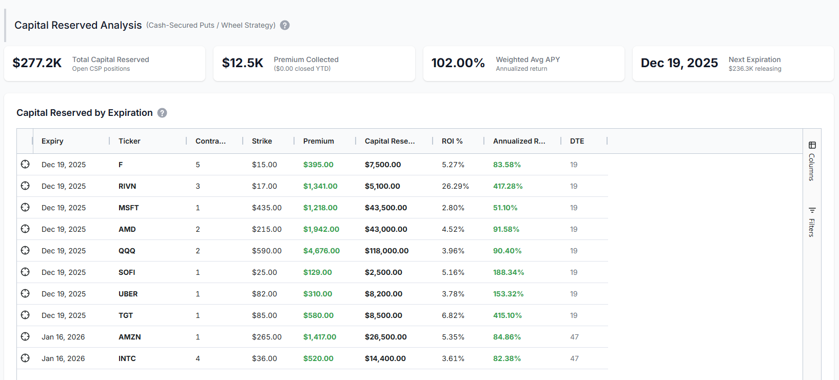
CSP Summary Metrics
Metric | What It Shows |
|---|---|
Total Capital Reserved | Sum of (Strike × 100 × Contracts) for all your short puts. This is your total assignment liability. |
Premium Collected | Total premium received from selling puts. |
Weighted Avg APY | Annualized return on reserved capital, weighted by position size. Higher = better return per dollar committed. |
Next Expiration | When your nearest CSP expires. Shows how much capital is about to be released (or assigned). |
CSP Return Calculations
For each CSP position, we calculate:
ROI % = (Premium Collected ÷ Capital Reserved) × 100
Annualized ROI = (ROI % ÷ Days to Expiration) × 365
Example: You sold a SOFI $15 Put for $0.85 with 30 DTE.
- Premium Collected: $0.85 × 100 = $85
- Capital Reserved: $15 × 100 = $1,500
- ROI %: $85 ÷ $1,500 = 5.67%
- Annualized ROI: (5.67% ÷ 30) × 365 = 68.9%
If the put expires worthless, you earned 5.67% in 30 days - equivalent to 68.9% annualized. The dashboard calculates this automatically for every CSP position.
Remember: Premium is NOT realized PnL! Nothing is realized unless 2 executions of opposite sides are matched.
Capital Release Schedule
The bar chart shows when your capital will be "released" (assuming no assignments):
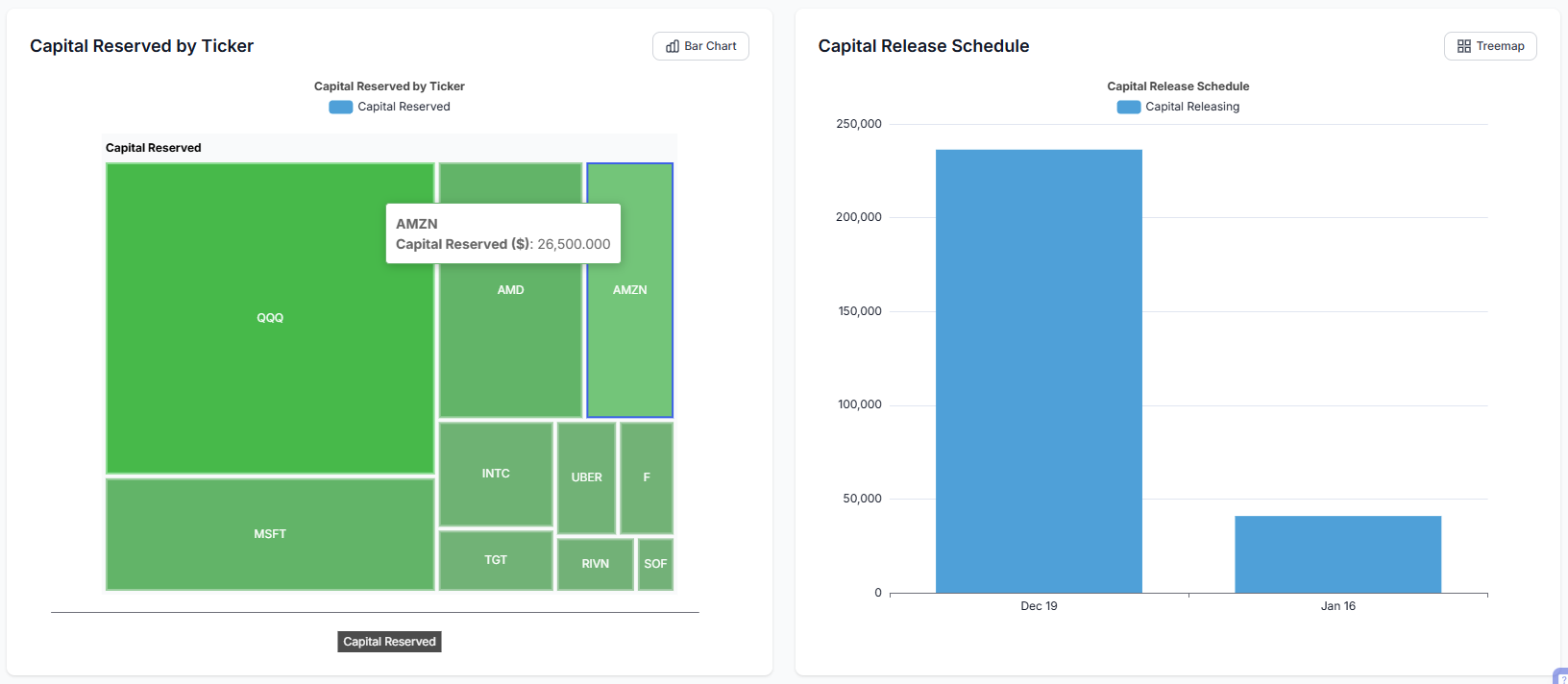
This helps you plan future capital deployment. After Dec 19 expiration, you might have $150K freed up for new trades or tied up in assignments if stocks dropped. Either way, you know exactly when decisions are coming.
Strategy Grouping: Powered by TradesViz Tags
The Options Command Center integrates seamlessly with TradesViz's existing tagging system. No new learning curve. No separate grouping mechanism. Just use the tags you're already using.
How It Works
- Assign tags to your options trades (e.g.,
iron_condor_spx,wheel_tsla,earnings_play) - The Command Grid automatically groups all trades with the same tag into one strategy row
- Greeks, P&L, capital, and DTE aggregate across the tagged group
If you're already using tags in TradesViz (and you should be (again!), see our complete guide to tags), your strategies will appear automatically in the Command Center.
Creating Strategy Groups
Two ways to group trades:
- Tag directly: Click the pencil icon on any trade in the trades table and add a tag (remember to add a comma after each tag)
- Bulk tag: Select multiple trades in the grid, click "Create Strategy Group," and assign a common tag name
Trades with Multiple Tags: "First Tag Wins"
What happens when a trade has multiple tags? For example, you might tag a position as both tech_longs and trend_days. In the Options Command Center, each trade appears under only its first (oldest) tag to prevent double-counting.
Here's why this matters:
- Accurate Greeks aggregation: Without this rule, a trade with 3 tags would contribute 3x to your Net Delta, Theta, etc. - completely misrepresenting your actual exposure.
- Correct Capital at Risk: The same trade's capital would appear in multiple strategy rows, making your total capital look 2-3x larger than reality.
- Grid totals match summary cards: The sum of Greeks in the Command Grid now equals the portfolio-level Greeks Summary Cards at the top.
How to identify trades with multiple tags: In the Strategy/Tag column, you'll see a badge like +1 or +2 next to the strategy name. This indicates the trades in that group have additional tags. Hover over the badge to see which other tags apply.
Best practice: Use your primary strategy classification as the first tag. Add secondary descriptors (like market conditions, timeframe, etc.) as additional tags. The first tag you add becomes the "owning" strategy in the Options Command Center.
Ungrouped Trades
Trades without tags appear as "Ungrouped - [SYMBOL]" in the grid. These are individual positions that haven't been assigned to a strategy. Best practice: always tag your trades. Even simple tags like speculative or income help organize your thinking.
Best Practices for Using the Options Command Center
Daily Monitoring Checklist (Turn this into a trade plan!)
- Check Net Delta: Is your directional bias where you want it?
- Review Net Theta: How much are you earning/losing daily to time decay?
- Scan for Red DTE: Any positions expiring within 7 days?
- Check P&L colors: Any strategies significantly underperforming?
Weekly Review Tasks
- Review payoff diagrams for positions with high unrealized P&L
- Check capital concentration by underlying (rebalance if needed)
- Evaluate CSP annualized returns – are you being compensated for the risk?
- Plan for upcoming expirations (roll, close, or let expire)
Risk Management Guidelines
Rule | Guideline | Why |
|---|---|---|
Single Position Size | No single position > 10% of capital | Limits damage from any one bad trade |
Single Underlying | No underlying > 20-25% of capital | Prevents concentration disasters |
Strategy Allocation | No strategy type > 50% of capital | Maintains diversification |
Delta Range | Keep portfolio delta within ±500 | Reduces directional blowup risk |
Too many things to keep track of? We already have trading goals to simplify certain goal tracking for you. Maybe we'll add some options, specific metrics to those?... let us know!
Common Mistakes to Avoid
Ignoring Theta When Net Long
If your Net Theta is -$300, you're losing roughly $300 per day just from time passing. Don't hold long options indefinitely, hoping for a move - time is literally money draining from your account.
Overleveraging CSPs
Selling $500K worth of puts when you have $100K in your account is a recipe for margin calls. The Capital at Risk section exists precisely to prevent this. Only sell puts you can actually afford to be assigned on.
Ignoring Expiration Clusters
If all your positions expire the same week, you face "expiration risk" - too many decisions at once, gamma risk spikes, and potential for cascading losses. Use the DTE color coding to identify and spread out your expirations.
Chasing High APY
A 500% APY on a CSP usually means extreme risk. The stock could easily drop through your strike. The dashboard shows you APY, but it also shows you the capital reserved. Balance yield with probability of success.
If you don't see your positions, make sure you have:
- Options trades imported (check our import guide if needed)
- Trades tagged with strategy names (see our tagging guide)
- Open positions in your account (the dashboard shows open options only)
Final Thoughts
Options trading requires managing multiple dimensions simultaneously - direction, time, volatility, and capital. Most traders try to do this with spreadsheets, broker screens, or worse, mental math. That approach doesn't scale.
The Options Command Center gives you the visibility you need in one unified dashboard:
- Aggregate Greeks across your entire portfolio
- Strategy-level grouping and analysis
- Capital at risk by strategy and underlying
- Interactive payoff diagrams
- Dedicated CSP analytics with ROI/APY calculations
This is institutional-level options portfolio management, built into the trading journal you're already using.
There's no other trading journal in the world that offers this level of options analytics. Not at any price point. We built it because options traders needed it, and no one else was going to do it right.
[Apr 2026 Update] Wheel Strategy Cost Basis Dashboard
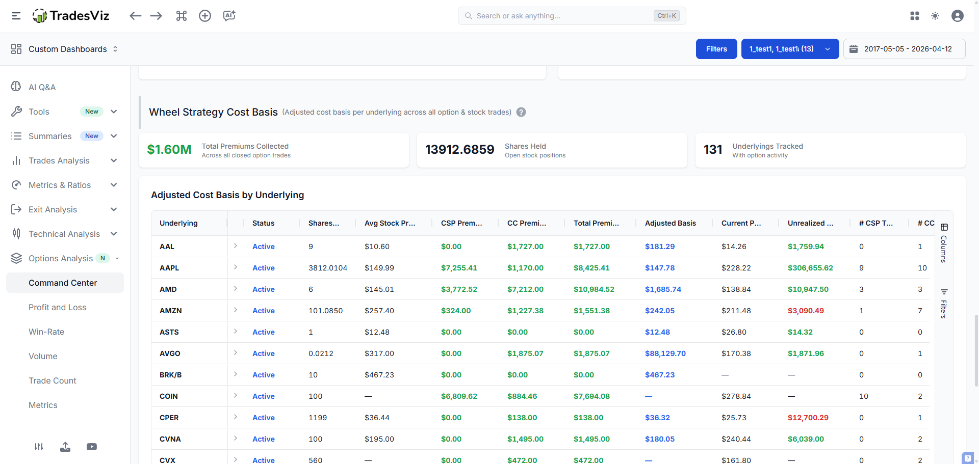
The most requested feature from wheel strategy traders is finally here: the Wheel Cost Basis Dashboard. This is a dedicated analytics view that tracks your entire wheel lifecycle — from selling cash-secured puts, through assignment, to writing covered calls — and computes the one number every wheel trader cares about: your premium-adjusted cost basis.
Unlike the CSP Analytics section above (which focuses on open put positions), the Wheel Cost Basis Dashboard looks at your complete trading history per underlying. It automatically identifies all short puts, covered calls, and stock positions tied to a given ticker, then aggregates them into a single row showing your true cost basis after factoring in every dollar of premium you’ve collected.
How It Works
The dashboard scans your entire account to classify every trade by underlying:
- Short Put Trades — Closed short puts (CSPs). These are puts you sold that either expired worthless or were bought back.
- Short Call Trades — Closed covered calls. Calls written against stock you held.
- Stock Trades — Stock positions from assignment or direct purchase.
- Open Short Puts / Calls — Currently open positions contributing pending premium.
For each underlying, the dashboard computes all of the stats described below and rolls them up into a single grid row. No tagging required — classification is fully automatic based on trade data.
Grid Columns Explained
Column | What It Shows | How It’s Calculated |
|---|---|---|
Underlying | The stock ticker | Grouped from all option and stock trades |
Status | Active, CSP Only, or Completed | Active = currently holding shares; CSP Only = only put trades, never assigned; Completed = full wheel cycle finished (bought & sold stock) |
Shares Held | Current stock position size | Sum of remaining quantity across open stock trades. Supports fractional shares. |
Avg Stock Price | Weighted average entry price |
|
CSP Premium | Total premium from short puts | For each closed short put: |
CC Premium | Total premium from covered calls | Same formula applied to closed short calls. |
Total Premium | CSP Premium + CC Premium | All option income for this underlying, across all time. Respects the Gross Collected / Net Kept toggle (see below). |
Adjusted Basis | Your true cost basis after premiums |
|
Current Price | Live market price | Fetched from market data for active positions. |
Unrealized P&L | Profit/loss on current shares |
|
Pending CSPs / CCs | Open short options not yet closed | Count and credit from options you’ve written that are still live. |
Total Trades / Executions | Trade and execution counts | All trades and executions contributing to this underlying’s wheel. |
Understanding Adjusted Cost Basis
This is the most important metric in the dashboard. Let’s walk through a full example:
- You sell a SOFI $10 put for $0.50 premium. It expires worthless. CSP Premium: $50
- You sell another SOFI $10 put for $0.60. You get assigned at $10. CSP Premium: $60 more. You now own 100 shares at $10.
- You sell a $11 covered call for $0.40. It expires worthless. CC Premium: $40
Your dashboard row for SOFI would show:
- Shares Held: 100
- Avg Stock Price: $10.00
- CSP Premium: $110 ($50 + $60)
- CC Premium: $40
- Total Premium: $150
- Adjusted Basis: $10.00 − ($150 / 100) = $8.50
Even though you bought SOFI at $10, your effective cost is $8.50 per share thanks to $1.50/share in premiums collected over the wheel lifecycle. If SOFI is trading at $9.00, your raw stock P&L shows a loss, but your adjusted basis tells you you’re actually still profitable.
[Jul 2026 Update] Gross Collected vs. Net Kept Premium
The example above assumes every option expired worthless, so “premium collected” and “premium kept” are the same number. Real wheels rarely look that clean — you roll calls and puts, buying them back for a debit and re-selling further out. When you do, the gross credit you originally collected overstates what you actually kept.
A new Premium toggle above the grid lets you choose how the CSP Premium, CC Premium, Total Premium, Adjusted Basis and Unrealized P&L columns are calculated:
- Gross Collected (default) — the total opening credit you wrote across all closed short trades, before any buybacks. This is the original behavior and is unchanged.
- Net Kept — the realized premium on closed trades only, with buy-to-close roll debits and commissions already netted out. Premium from options that are still open is excluded entirely. This is the number that reflects what you truly banked after rolling.
Example: you write a covered call for $3.00, later buy it back for $2.00 to roll it, then sell the new call for $1.50 and let it expire. Gross Collected counts $3.00 + $1.50 = $450 in credits. Net Kept counts ($3.00 − $2.00) + $1.50 = $250, minus commissions — the premium you actually kept. The toggle recalculates instantly (no reload) and the comparison chart follows the selected mode.
Use Gross Collected to see how much income the position has generated in total, and Net Kept for a conservative, roll-aware effective cost basis.
Expand Row: Drill Into Every Trade
Click the expand arrow on any row to see every individual trade that contributed to that underlying’s wheel. The detail grid shows:
- Symbol — Full option symbol or stock ticker
- Type — Option, Stock, Future Option, etc.
- Position — Long or Short
- Open / Close Dates — Trade lifecycle
- Open / Close Price — Entry and exit prices
- Quantity, Open Qty, P&L, Commissions, Fees
Each detail row also has an Explore button that takes you directly to the full trade detail view for deeper analysis. This gives you complete audit-trail visibility from the high-level cost basis number all the way down to individual executions.
Summary Cards
Above the grid, three summary cards give you the portfolio-wide picture:
- Total Premiums Collected — Combined CSP + CC premium across all underlyings. Follows the Gross Collected / Net Kept toggle, and its label updates to “Net Premium Kept” in net mode.
- Total Shares Held — Current stock positions from the wheel (supports fractional quantities)
- Total Underlyings — How many tickers you’re running the wheel on
Cost Basis Comparison Chart
Below the grid, a stacked bar chart compares the original stock cost vs. the premium-adjusted cost basis across all your underlyings. This visual makes it immediately obvious which wheels have generated the most premium relative to their stock cost, and which positions still need more premium collection to meaningfully reduce your basis.
Premium by Underlying Chart
A separate chart (available in treemap and stacked bar views) breaks down put premium vs. call premium by underlying. Toggle between views using the chart-type button. The treemap is useful for quickly spotting which underlyings are generating the most income, while the stacked bar lets you compare CSP vs. CC contributions side by side.
Important Notes on Premium Calculations
Premium ≠ Realized P&L. Premium collected is the credit you received when selling the option (sell_price × quantity × 100). Realized P&L is what you kept after closing the trade. If you sold a put for $1.00 and bought it back for $0.30, your premium collected was $100 but your realized P&L is $70. By default the dashboard uses premium collected (Gross Collected mode) because that’s the raw income figure — but switch the toggle to Net Kept to base every premium and cost-basis figure on realized-after-rolls premium instead ($70 in this example).
Multi-leg spreads are handled safely. If your account contains multi-leg option trades (iron condors, verticals, etc.), the dashboard detects them and uses realized P&L instead of the raw sell-credit formula. This prevents double-counting that would occur from how spreads store their cost basis internally. Single-leg wheel trades (CSPs and CCs) use the precise sell-credit calculation.
[May 2026 Update] Combined Monthly + Strategy Summary
The Combined Monthly + Strategy Summary was built to solve a real workflow problem for active options traders: one spreadsheet for monthly performance bookkeeping, another for strategy-level open risk. This section combines both into one place, but keeps them as two distinct tables because they answer different questions.
- Monthly Cashflow-Style Rollup answers: "How did each month perform across stocks, options cashflows, and account credits/debits?"
- Strategy Risk / Reward Snapshot answers: "What is my current strategy-level risk profile and P&L state right now?"
Table 1: Monthly Cashflow-Style Rollup
This table is the accounting lens. It aggregates monthly buckets so you can reconcile how option premium flows, stock realization, and account-level transactions combine into month-level P&L.
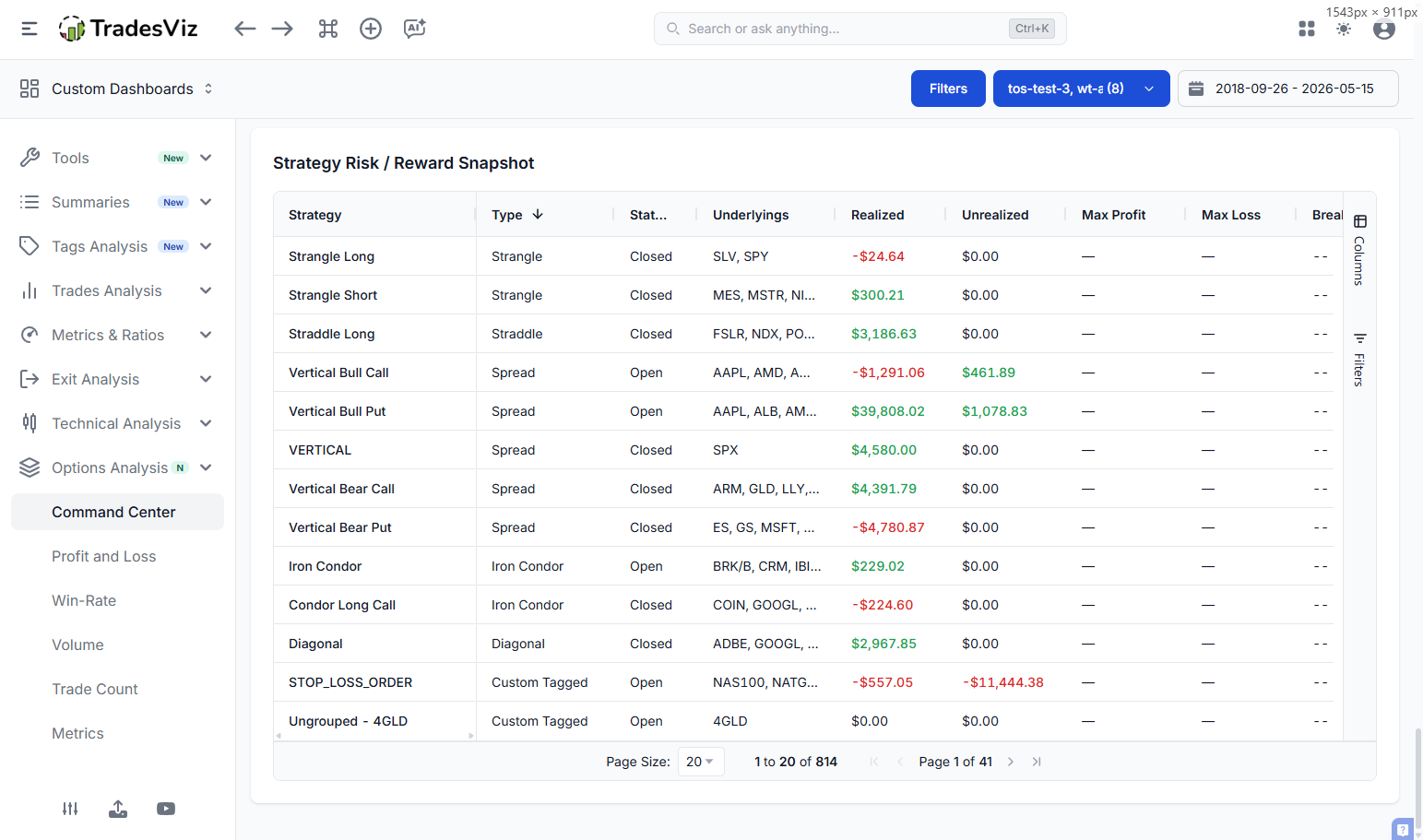
Column | What It Tracks | How To Use It |
|---|---|---|
Month | Month bucket (display label + internal month key ordering) | Sort ascending/descending to compare cycles. Month sorting uses true chronology, not text sorting. |
Stocks Realized | Realized stock/index/future trade P&L closed in that month | Separate directional stock performance from options premium flow. |
Long Options Realized | Realized P&L from long option trades closed in that month | Measure debit-option performance independent of short premium selling. |
Short Options Cashflow | Monthly buy/sell cashflow from short-option activity | Track premium-in / premium-out timing by month. |
Spreads/Condors Cashflow | Cashflow bucket for multi-leg option structures | Quickly see how structured trades contributed to monthly flows. |
Dividends / Interest / Adjustments + FX / Other Credits-Debits | Non-trade account flows pulled into the same month view | Reconcile statement-level month performance instead of looking only at trade P&L. |
Total P&L | Net monthly rollup from all above components | Use this as your month-over-month operating P&L view. |
Conceptually: this table is not an "open risk" table. It is a month-level ledger-style rollup designed for attribution and reporting.
Table 2: Strategy Risk / Reward Snapshot
This table is the risk-state lens. It groups trades by strategy/tag and summarizes the current state of each strategy: realized/unrealized performance, time risk, and payoff snapshot metrics where available.
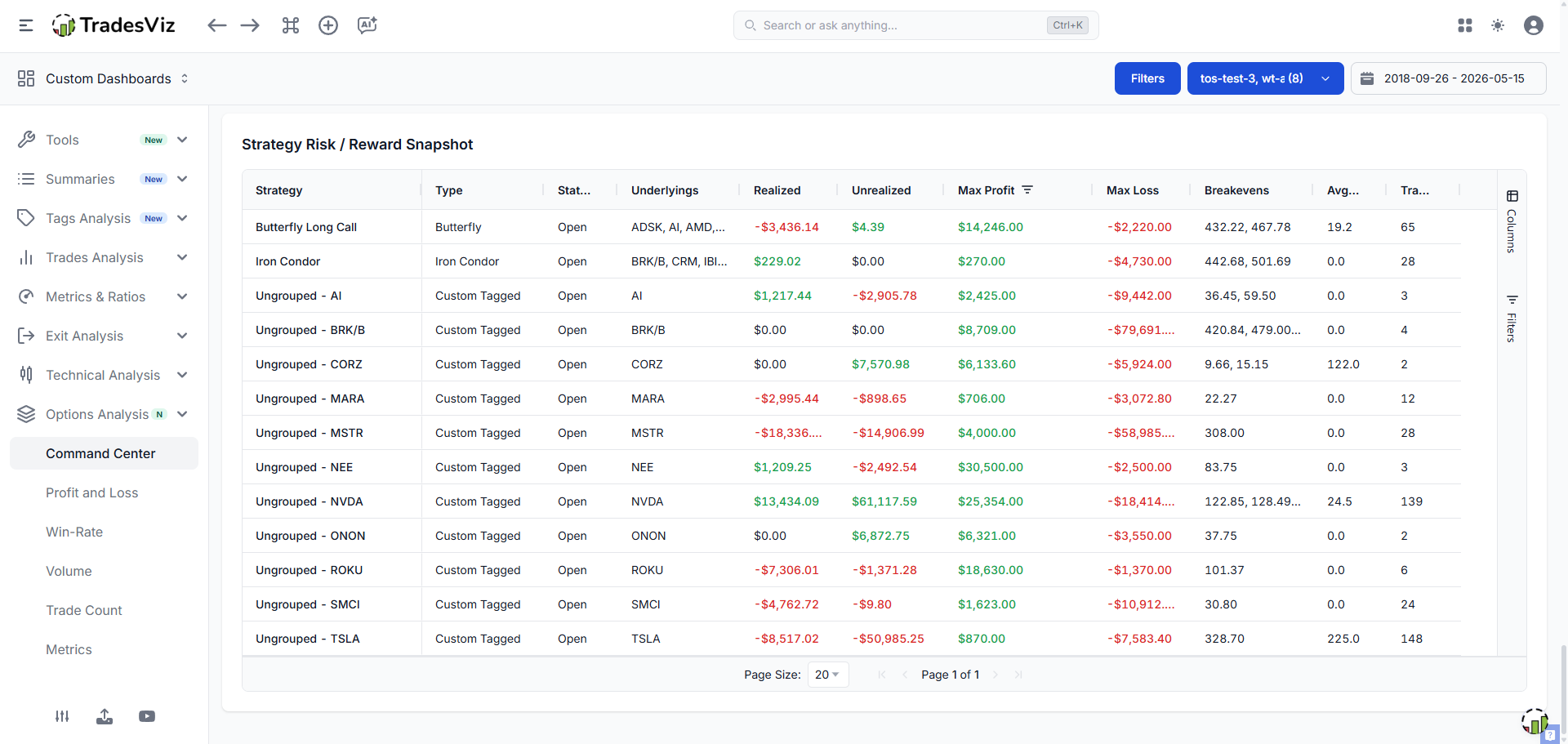
Column | What It Tracks | How To Use It |
|---|---|---|
Strategy / Type / Status | Grouping key, inferred strategy class, and open/closed state | Triage active strategies first, then review closed strategy outcomes. |
Underlyings | Underlying symbols in the strategy group | Spot concentration and cross-symbol clustering quickly. |
Realized / Unrealized | Closed P&L versus currently open P&L | Distinguish locked-in gains from mark-to-market exposure. |
Max Profit / Max Loss / Breakevens | Strategy-level payoff snapshot values | Use for rough risk envelope checks; run the dedicated payoff diagram for full scenario analysis. |
Avg DTE | Average days-to-expiry for open legs in the strategy | Prioritize management order by time risk and expiry compression. |
Trades | Trade count in strategy group | Gauge structure complexity and likely management overhead. |
Important Behavior Notes
- Payoff snapshot source: Max profit, max loss, and breakevens are read from cached payoff snapshots in trade greeks for performance.
- When values are blank: If cached snapshot values are unavailable for a group, the table shows placeholders (for example,
--) until the manual recalculation is run for those trades. You can do this by exploring the trade and clicking on the recalculate button above the executions table or by selecting trades in the main trades table and applying a recalculation group apply action on the selected trades. - Full payoff modeling: The dedicated Portfolio Payoff Diagram remains the most complete what-if tool for curve-level analysis.
These new additions make TradesViz the most comprehensive options tracking platform online. Remember all of the tables here share the same abilities, such as filtering, exporting, visualization, etc., as explained in our tables blog post.
[May 2026 Update] Options Premium Timeline (Cumulative + Daily)
The new Options Premium Timeline section gives you a cleaner way to answer two different questions:
- How much premium did I collect/realize each day? (Daily mode)
- How are collected and realized totals compounding over time? (Cumulative mode)
You can switch this instantly using the right-side toggle: Mode: Cumulative or Mode: Daily.
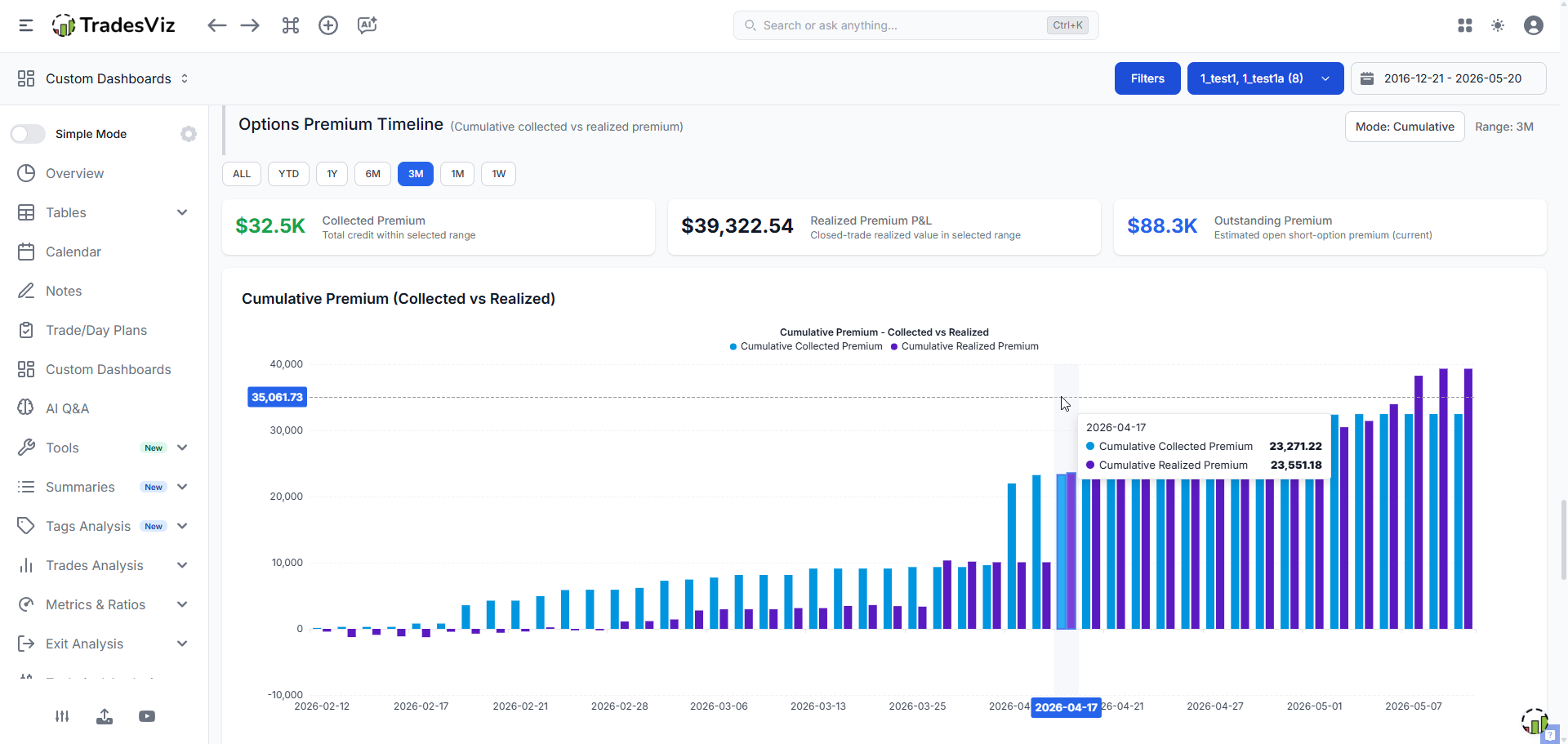
What You Get in This Section
- Range filters:
ALL,YTD,1Y,6M,3M,1M,1W - Cards: Collected Premium, Realized Premium P&L, Outstanding Premium
- Chart: Collected vs Realized in either Daily or Cumulative mode
How the Premium Calculations Work
1) Collected Premium (credit received from short options)
For standard short option trades, collected premium is computed from opening short credit:
Collected = Sell Credit × Contracts Sold × Contract Multiplier
For multi-leg option structures where credit is stored as aggregate notional, the dashboard uses the stored aggregate sell credit directly to avoid double counting.
2) Realized Premium P&L
Realized uses the closed-trade base net P&L value:
Realized = Base Net P&L (closed short-option trades)
This reflects what was actually kept/lost after close, not just opening credit.
3) Outstanding Premium (open exposure)
For still-open short options:
Outstanding = Open Credit × Remaining Quantity × Contract Multiplier
For multi-leg trades, outstanding is scaled proportionally by remaining size when needed.
Important: Collected premium is credit-in. Realized premium is closed P&L. They are related but not the same number.
Daily vs Cumulative (Toggle Behavior)
Mode | What the Chart Shows |
|---|---|
Daily | Per-day collected and per-day realized values for the selected range. |
Cumulative | Running totals of collected and realized values over time. |
Range Filter Behavior
- Collected card: Sum of daily collected values in the selected range
- Realized card: Sum of daily realized values in the selected range
- Outstanding card: Current open outstanding premium (not range-limited, because it represents current open exposure)
Quick Example
Date | Collected (Daily) | Realized (Daily) | Collected (Cumulative) | Realized (Cumulative) |
|---|---|---|---|---|
Day 1 | $500 | $0 | $500 | $0 |
Day 2 | $300 | $120 | $800 | $120 |
Questions? Feedback? Feature requests? Reach out to us at support@tradesviz.com or use the live chat. As always, we're building TradesViz based on what traders actually need and we read every message.
Updated on: 17/07/2026
Thank you!